Week 9
THE MILL X SCAD
Week 9 Goals & Feedback
Feedback from Week 9 Mentor Session
Shots 1 / 2
Pools of light on ground working well
Take a look at film noir references, use this for aesthetic direction
Don't lose vespa in busy background, make sure Vespa is center of attention (I can play with this in comp using aovs and fresnel mask of vespa)
Fall-off of light in shot 1 too strong, soften fall-off and possibly lower intensity so that it isn't too distracting
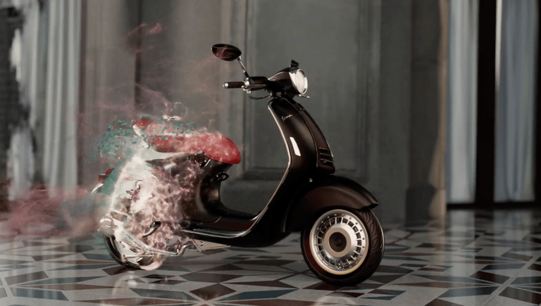
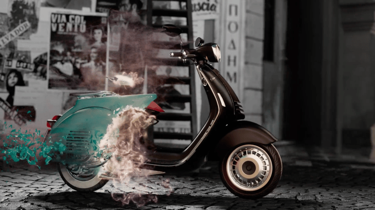
Shot 3
3a (retro env)
Lower cobblestone ground plane
Angle lighting in 3a, angle it to side to contour vespa instead of lighting it dead on
Subtle DOF, focus should be on vespa, not background
enable displacement cobblestone
3b (modern env)
re-arrange buildings to match same geo placement/ composition as retro environment, this will ease the transition effect)
Transition (background)
softer fall off of transition, we should not notice it more than the vespa fx / it should not be distracting
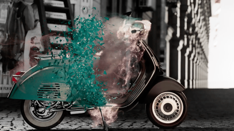
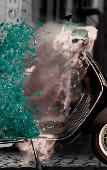
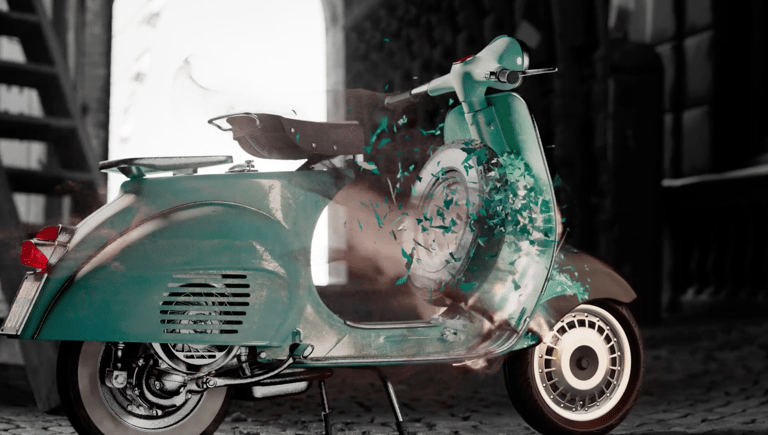
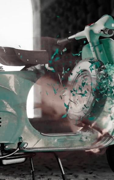
Vespa FX
more combined as a whole, make it feel less separated
fix alpha before redner (turn off atmosphere for render layers)
Shot 4
Lower bump of floor
My Goals / Responsibilities for Week 9
Shots 1/2
Push "film noir" look in nuke
Subtle DOF
Noise Cards for headlight
Shot 3
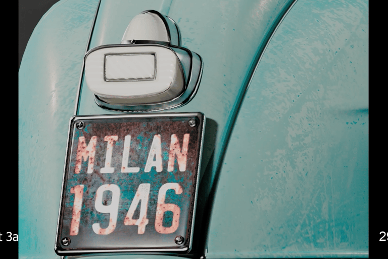
Final Look-Dev of License
Adjust Headlight Light
Bring key light to left, use it to contour vespa
Comp
DOF, make vespa the star and drag less attention away from background transition
Add post bloom / lens flare in shot 3b
Shot 4
Bloom / Lens Flare
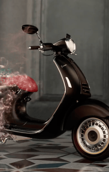
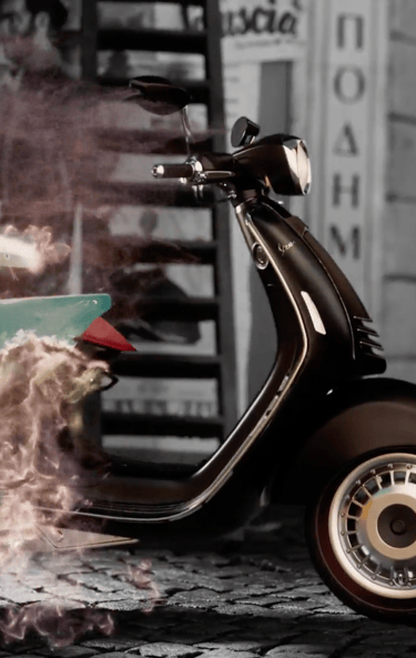
Shot 3 Lighting
&
License Look-Dev
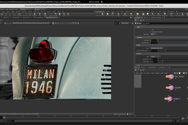
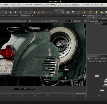
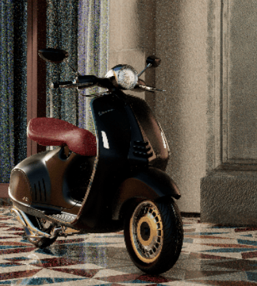
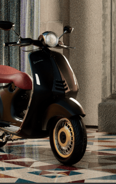
After our last meeting with the mentors, I started with applying the notes for shot 3 lighting as shot 3 felt the most behind in our progress over the past few weeks. In the previous week, the lighting still felt very dead-on lit from the front. This created any lack of rim or contour, and in turn did not bring out any details that my teammate spent time doing look-dev for. Taking our mentor Natasha's advice, I will bring this specific key light we used in shots 1/2 and bring it to the far right to help in shaping the vespa.
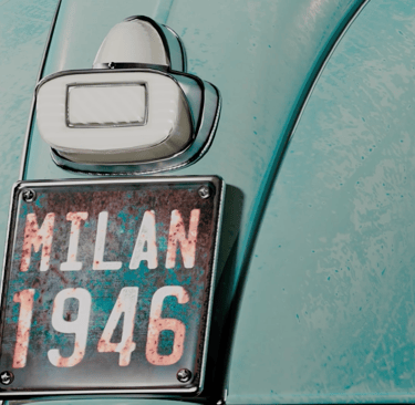
Lighting from Week 8

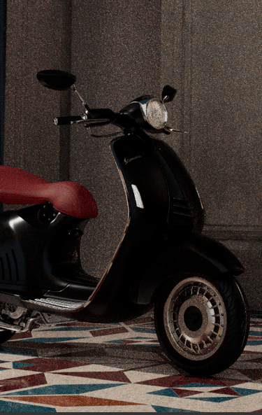
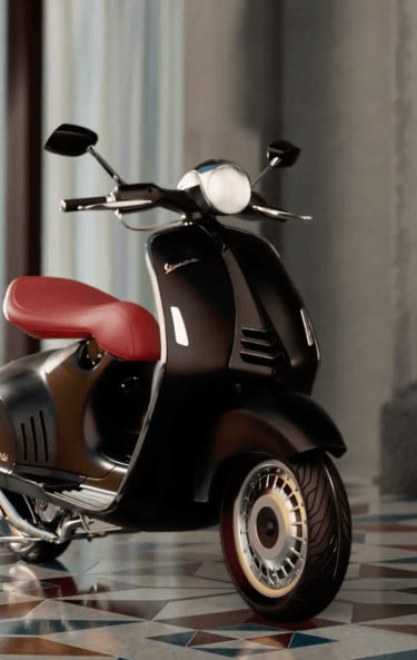
I began the adjustments by moving the key to the far right. Immediately, I noticed a difference in how this helped to shape the Vespa and give it more life than it had before, but in turn, the license plate can no longer be seen. When I look at this shot, my eye is attracted to the most detailed part in the center, the license, and I knew it still had to remain lit in order for it to read correctly in the shot.
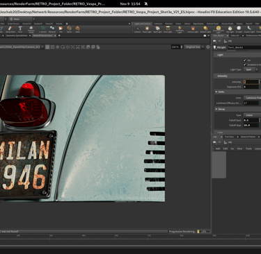
Next, I thought adding a new light to separate light the area around the license plate would help make the shot more readable for the viewer. This did help in making the text of the Vespa more clear, but it did take away from the contour of the Vespa itself. I knew this wasn't the case to light-link either, as it would make the license's lighting sit in a different world than the rest of the vespa's lighting and feel slightly jarring.
For the next shot, I decided to turn down the intensity of thefront facing light as well as the rim light, in order for the main lighting to come from screen right.
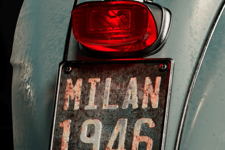
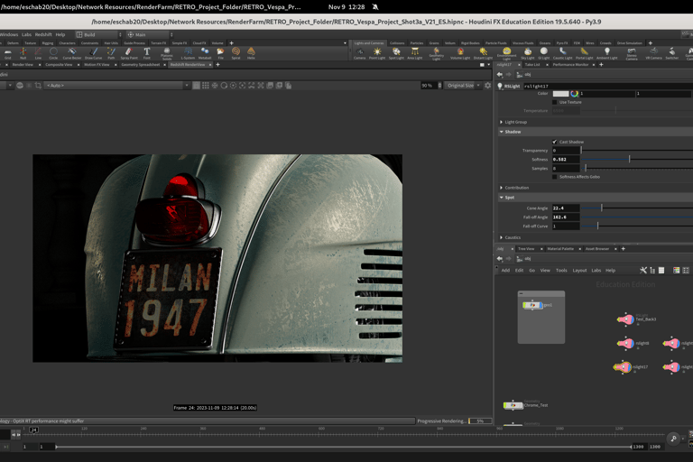
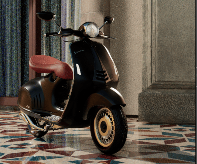
While I was adjusting the lighting, I took this time to adjust the material and inputs I created in the License. I wanted the light from above to interact with the specularity of the chrome and letters.
First, I changed the specularity and roughness contrast of the license material. Then I went into the light inside the red back-light and changed the point light to be more intense.
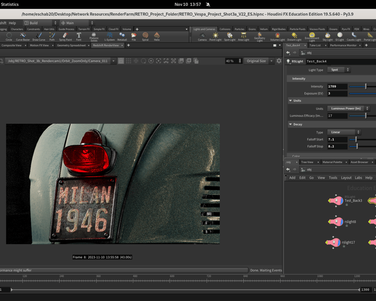
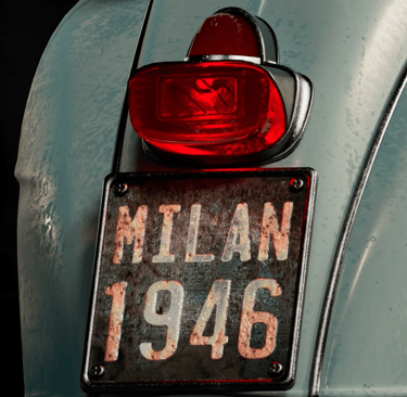
Back-Light and License Look-Dev Update
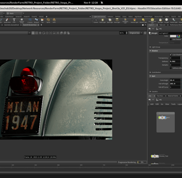
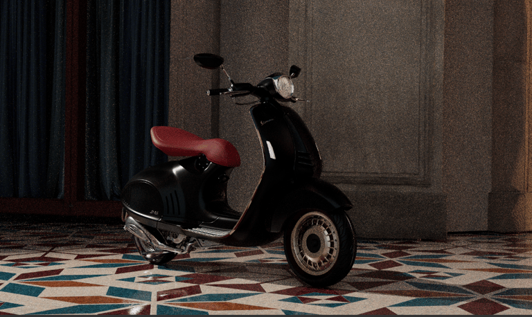
Thursday night, I sent out this lighting to our mentors to ask if there was any last-minute feedback for the lighting update in this shot. After hearing that I could bring the key to the left to help with continuity sake, this opened up a new door of possibility. I no longer needed the extra light for the license as the angle of the new key could both achieve shaping and light the license currectly, and the bounce off the buildings in screen right provided a nice reflection on the right of the vespa!
Shot 4 Lighting
&
Environment Update
Another note taken from our mentors over the past week was to have our modern environment match the same structure and layout as our retro environment. This would ease the transition swiping over the screen and make it feel cohesive. I went into the shot's file and brought the building back forward until it matched the same composition among shots 3a/3b.
In the new composition, the large corridor seen from shot 4 is now to screen left of this shot. Thus, I kept the key from that direction to hit the buildings in the same manor between both shots, but, the vespa's placement change needed another key from screen left.
This screen left key spot light was not helping to improve the lighting of the vespa, so I changed the direction and added one more rim light from the opposite side to aid in shaping.
I added a second rim in the image to the right, but this felt unnecessary and artificial, so I removed it after the fact. Now, the seat felt too overlit from the extra rim as well.
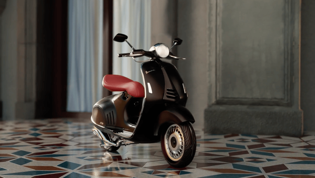
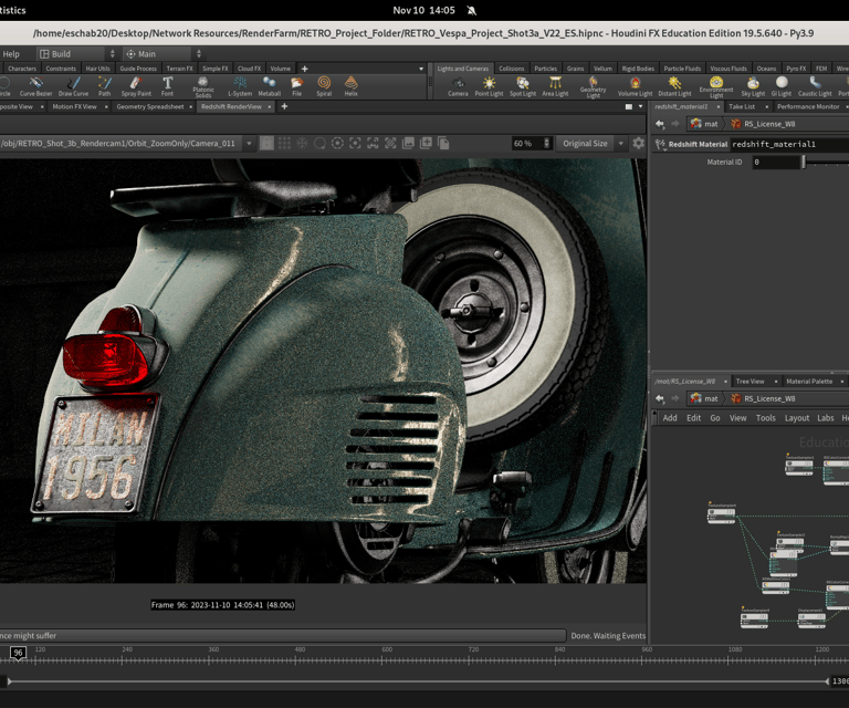
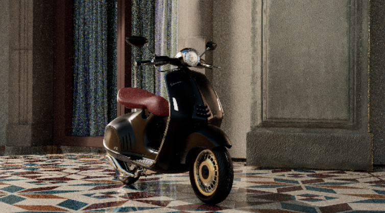
Final Lighting Shot 3-b
Shot 3 Transition and Comp with FX
I want to shout out my team member Sam Gualtieri for helping to comp shots 1/2 this week while I was occupied with lighting and compositing in shots 3a/3b and shot 4. Not only this, but he was responsible for the final transition wipe used in shot 3! It created a very subtle mask to use between the 2 environments for me to comp together.